Skip to content
Grav 2.0 is officially stable. Read the announcement →

Community guidelines

Please keep discussions civil and on-topic. Repeated violations may lead to a temporary ban.

Themes & Styling

Mobile menus with Quark

Started by Dakta 8 years ago · 4 replies · 2631 views
8 years ago

Hi,
Is there a way to change how the menus are shown on a mobile site?
(I have the 'Mobile detect plugin' installed)
With the Antimatter theme, the menus on a mobile are looking like this:
Screenshot_20180310-055801|281x500
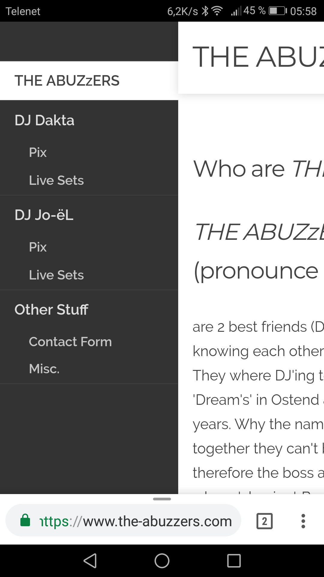
That makes the it easy to select a menu when you have 'big' fingers. (like mine for example :-) )

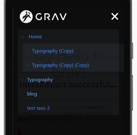
When I change the theme to Quark, it then looks like this:
Screenshot_20180310-055844|281x500

Not that easy to use, so I would like to ask if there is something I can change so that the menus are displayed in expanded mode instead of having the '+' sign in front of the menus.

Thanks a lot for your help.

8 years ago

Hi djdakta,

first of all sorry for my english.
I have had the same problem with 'big' fingers.
My idea was to modify the quark template to have the menu text act as button additionally to the plus/minus sign.
I am a newbie in web-development therefore my solution may be a bad hack and someone can provide a better (correct) solution for this problem.

I added the following code at line 63 in jquery.treemenu.js:

JS
this.find("> li:not(.tree-empty)").each(function() {
    e = $(this);
    anchor=e.find('a:first');
    toggler=e.find('span:first');
    toggler.html(anchor.html().trim());
    anchor.html('<br>');
    anchor.attr("href","#");
});

This pulls the text out of the submenus parent and adds it to the toggler.
The text of the submenus parent is replaced by a line break.
In the first place I tried to hide the submenus parent but then the layout of the menu gets messed up.

Additionally you have to adjust font sizes and margins for the toggler in _mobile.scss to match the style of the rest of the menu:

CSS
.toggler {
    cursor: pointer;
    vertical-align: top;
    font-size: 1rem;
    line-height: 1rem;
    padding-left: 5px;
    float: left;

    &:before {
      display: inline-block; margin-right: 5pt;
    }
  }
👍 1
8 years ago

Hi pmo,

Thanks for your reply. (and sorry for my bad english)
I'll do the changes as you've explained it and I'll let you know what the result is.
I was thinking in the same direction as you but was not sure of myself. 😦

5 years ago

Thank you "pmo", it helped a lot! To get a bit a wider tab-range and that Submenu Point colored when active, I put two more lines in your code (the css has to be customized):
<code>
.... anchor.attr("href","#");
toggler.css({"cssText" : "padding-right: calc(100% - 220px)" });
if (e.children().hasClass("active")) { toggler.css({"cssText" : "color: var(--color1); opacity: 1 !important; font-weight: 600; padding-right: calc(100% - 220px)" })};
});
</code>

last edited 12/12/21 by Beat Dietschweiler
5 years ago

Hi,

You can test this and modify the values to your needs

CSS
/* 
    ############# <a> --- Enlarge the click area (min recommended 20px)
*/

.treemenu li {
    /* REMOVE */
    padding: 5px 0;
}

.treemenu li a {
    /* ADD -  Increasing the height */
    padding: 13px 0;
}

/* 
    ############# .toggler
*/
.treemenu li {
    /* ADD */
    display: -webkit-box;
    display: -ms-flexbox;
    display: flex;

    -ms-flex-wrap: wrap;
    flex-wrap: wrap;

    -webkit-box-align: stretch;
    -ms-flex-align: stretch;
    align-items: stretch;
}

.treemenu li a {
    /* REMOVE */
    margin-left: 1.2rem;
}

.treemenu ul {
    /* ADD */
    -webkit-box-flex: 0;
    -ms-flex: 0 0 100%;
    flex: 0 0 100%;
    max-width: 100%;
}

.treemenu .toggler {
    /* REMOVE */
    line-height: 1rem;
    float: left;
    padding-left: 5px;

    /* ADD */
    padding: 0 10px; /* Increase width */

    display: -webkit-box;
    display: -ms-flexbox;
    display: flex;

    -webkit-box-align: center;
    -ms-flex-align: center;
    align-items: center;
}

It should look like this

quark-theme-menu-mobile|444x437

Suggested topics

Topic Participants Replies Views Activity
Themes & Styling · by Pedro M, 2 months ago
4 198 2 months ago
Themes & Styling · by Ian, 2 months ago
3 94 2 months ago
Themes & Styling · by Norbert, 2 years ago
11 455 3 months ago
Themes & Styling · by Lukáš Findeis, 3 months ago
0 48 3 months ago
Themes & Styling · by Sebadamus, 4 months ago
5 128 3 months ago