Skip to content
Grav 2.0 is officially stable. Read the announcement →

Community guidelines

Please keep discussions civil and on-topic. Repeated violations may lead to a temporary ban.

Support

Mobile styles are off - can anyone help with good CSS?

Solved by Amaury Hanser View solution

Started by werdi 6 years ago · 11 replies · 568 views
6 years ago

Hey there,

I don't understand what I'm doing wrong here, can anyone help with good CSS?

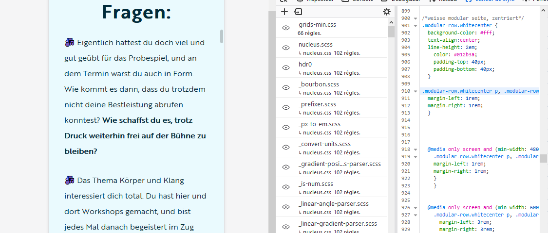
I'm using the antimatter theme and am trying to make the column more narrow for big screens. Now it turns out that when I look at it from an actual mobile phone, the margins are completely off.

Thanks!

This is the page:
https://www.mariabusque.net/ueben

This is the CSS I was using to adjust the margins:

CSS
.modular-row.center p, .modular-row.center h3, .modular-row.center h1, .modular-row.center h2 .modular-row.center h4 {
    margin-left: 12rem;
    margin-right: 12rem;
    }

@media only screen and (min-width: 480px) {
    .modular-row.center p, .modular-row.center h3, .modular-row.center h1, .modular-row.center h2, .modular-row.center h4 {
    margin-left: 1rem;
    margin-right: 1rem;
    }
}

@media only screen and (min-width: 600px) {
    .modular-row.center p, .modular-row.center h3, .modular-row.center h1, .modular-row.center h2, .modular-row.center h4 {
        margin-left: 3rem;
        margin-right: 3rem;
        }
}

@media only screen and (min-width: 801px) {
    .modular-row.center p, .modular-row.center h3, .modular-row.center h1, .modular-row.center h4 {
        margin-left: 6rem;
        margin-right: 6rem;
        }
}

@media only screen and (min-width: 1025px) {
    .modular-row.center p, .modular-row.center h3, .modular-row.center h1, .modular-row.center h4 {
        margin-left: 10rem;
        margin-right: 10rem;
        }
}

@media only screen and (min-width: 1225px) {
    .modular-row.center p, .modular-row.center h3, .modular-row.center h1, .modular-row.center h4 {
        margin-left: 16rem;
        margin-right: 16rem;
        }
}

@media only screen and (min-width: 1525px) {        
    .modular-row.center p, .modular-row.center h3, .modular-row.center h1, .modular-row.center h4 {
        margin-left: 22rem;
        margin-right: 22rem;
        }
}

@media only screen and (min-width: 1525px) {
   .modular-row.center h2 {
    margin-left: 16rem;
    margin-right: 16rem;
    }
}
last edited 08/12/20 by pamtbaau
6 years ago Solution

@werdi:

CSS
.modular-row.center p, .modular-row.center h3, .modular-row.center h1, .modular-row.center h2 .modular-row.center h4 {
  margin-left: 12rem;
  margin-right: 12rem;
  }

On mobile, your margin are 12rem. Just set them to 1rem or anything that suits you.

6 years ago

@werdi, Same issue with .modular-row.whitecenter, .modular-row.testimonial, .modular-row.greycenter etc...

last edited 08/12/20 by pamtbaau
6 years ago

I thought I had set the styles on mobile correctly... which one are you referring to?

6 years ago

@werdi:
which one are you referring to?

The first line that you posted.

6 years ago

@AmauryH I set that line to 1rem but don't see any difference...

6 years ago

Have you cleared grav cache ?
It might be the issue.

The line to change is the line 910 in custom.css

margin|690x294

6 years ago

@werdi,

Instead of setting the margins to 1rem, I think you should delete the following snippets from '/css/custom.css'. This will allow the content of each module on mobile devices to occupy the full width of the device.

The parent container of the module already sets a margin of 1rem. Setting the margins also for the content to 1rem will double the margins to 2rem.

Delete at line 910:

CSS
.modular-row.whitecenter p, .modular-row.whitecenter h3, .modular-row.whitecenter h1, .modular-row.whitecenter h2 {
    margin-left: 12rem;
    margin-right: 12rem;
}

At line 1034:

CSS
.modular-row.center p, .modular-row.center h3, .modular-row.center h1, .modular-row.center h2 .modular-row.center h4 {
    margin-left: 1rem;
    margin-right: 1rem;
}

Note: The above snippet sets the margins to 1rem, which seems ok, but there already is a margin of 1rem set by the parent container.

At line 234:

CSS
.modular-row.testimonial p, .modular-row.testimonial h3, .modular-row.testimonial h1, .modular-row.testimonial h2 {
    margin-left: 12rem;
    margin-right: 12rem;
}

Hope this helps...

By the way, the button 'JETZT KOSTENFREI ANMELDEN' does not wrap on mobile.

👍 1
last edited 08/13/20 by pamtbaau
6 years ago

@pamtbaau Thanks so much for taking the time to look into this, I appreciate it. I had already noticed about the button text. Will look into this today, and also the other issues you have pointed out. Thanks again!

6 years ago

@werdi, I think you can solve the wrapping of the button text, by adding white-space: break-spaces; to the <span>

👍 1
last edited 08/13/20 by pamtbaau

Suggested topics

Topic Participants Replies Views Activity
Support · by Thomas, 1 week ago
2 53 10 hours ago
Support · by Anna, 3 days ago
2 60 13 hours ago
Support · by Justin Young, 14 hours ago
1 30 14 hours ago
Support · by Duc , 1 week ago
2 65 5 days ago
Support · by Colin Hume, 1 week ago
2 56 5 days ago